The Charm of Light Pink: A Journey Through Symbolism, Culture, and Design
Have you ever stopped to admire the soft magic of light pink? Picture stepping into a room filled with the gentlest blush tones. Every surface seems to whisper elegance and warmth. The Charm of Light Pink is more than just a color; it’s an experience that goes beyond looks.
Pink has traveled a long way, from the soft hues in Renaissance paintings to today’s fashion. It’s a color that blends both strength and softness, defying simple labels. It moves between being seen as masculine and feminine.
Exploring light pink, you’ll find a world of cultural depth, design creativity, and emotional connection. This color is not just a shade; it’s a storyteller. It carries centuries of human feelings in its gentle touch.
The Historical Evolution of Light Pink Through Ages
Explore the captivating history of light pink, a color that represents feminine elegance and soft romanticism. Pink has changed a lot over time, becoming a symbol of culture and art.
The tale of pink starts much earlier than you might think. Homer’s Odyssey, from 800 B.C., hints at the color we know today. The word “pink” was first used in the 17th century by a Greek botanist. He was inspired by the look of carnations.
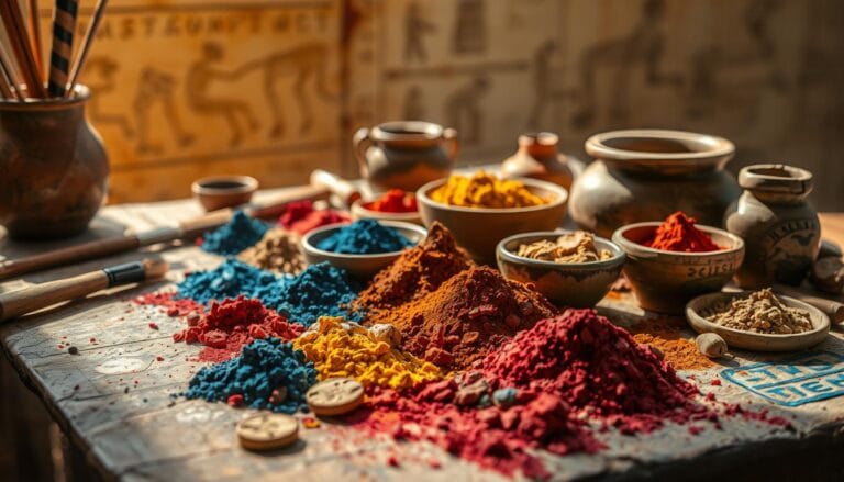
Ancient Civilizations and Pink Pigments
Old cultures were clever in making pink pigments. They got colors from:
- Madder roots
- Brazilwood
- Cochineal insects from South America
These early artists used pink to add beauty to art, makeup, and buildings. Pink was also used in religious pictures to show innocence. This shows pink’s deep spiritual meaning.
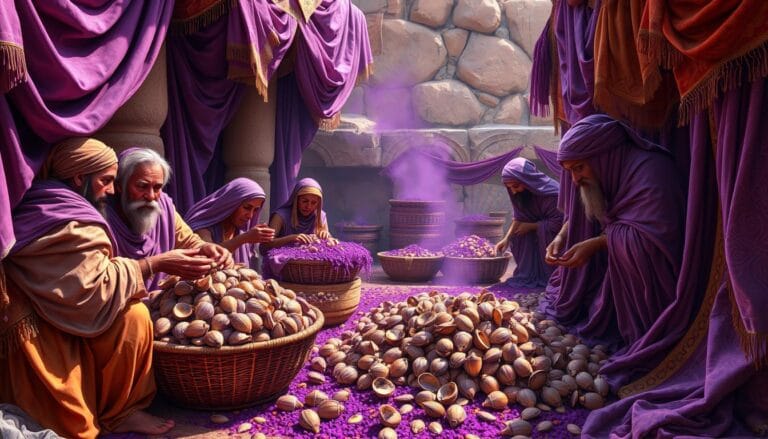
Pink in Medieval Times
In medieval times, pink was quiet, hidden by stronger colors. But it was still seen in art and culture, showing its beauty.
Renaissance and Revival Period
The Renaissance changed pink’s role. Artists like Cennino Cennini mixed Venetian Red and St. John’s White to create pink. The Rococo movement in the 18th century made pink a sign of high class.
“Pink is the color of unconditional love, of understanding, of compassion.” – Unknown
By the mid-18th century, pink was popular for both men and women in high society. Its history shows pink is more than just a light color.
The Psychology and Science Behind Pink’s Appeal
Pink is more than a color; it’s a deep emotional experience. It touches our perception in ways that amaze us. Research shows pink can change our mood, making us feel warm and calm.
Studies on color psychology show pink’s big impact on our feelings. It can change our mood and actions:
- Reduces aggression by up to 20%
- Makes us feel tender and compassionate
- Makes spaces feel calm and inviting
The science behind pink’s effect is fascinating. When we see pink, our brain responds in calming ways. This is why pink places feel cozy and welcoming.
“Color is a power which directly influences the soul” – Wassily Kandinsky
About 95% of people say pink makes them feel good. It’s a mix of red and white, giving it energy and softness.
In therapy, pink is a key tool for healing. It helps deal with bad feelings, making us relax and find balance.
The Charm of Light Pink: Cultural Significance and Symbolism
Light pink is more than just a color; it’s a symbol with deep meanings across cultures. It stands for subtle sophistication and soft romanticism in many societies.
Exploring light pink’s cultural meanings shows how colors shape our feelings and views. It tells a story of human experiences, from ancient times to today.
Eastern Cultural Interpretations
In Japan, light pink is linked to cherry blossoms. It symbolizes:
- Ephemeral beauty
- Transient moments of life
- Renewal and hope
In India, light pink is celebrated during Holi. It represents:
- Unbridled joy
- Celebratory spirit
- Welcoming of spring’s energy
Western Symbolism and Meanings
In the West, light pink has changed a lot. Surveys show it’s linked to feminine elegance, like:
- Charm and politeness
- Sensitivity and tenderness
- Romance and childhood innocence
Pink wasn’t always seen as feminine. In the 1920s, light red was seen as masculine, showing how our views have changed.
Modern Cultural Impact
Today, light pink is a key symbol in social talks. It’s used in gender identity debates and branding, showing its versatility and depth.
| Cultural Context | Pink Symbolism |
|---|---|
| Fashion | Versatility and expression |
| Social Movements | Solidarity and empowerment |
| Design | Softness and emotional depth |
Learning about light pink’s cultural journey shows how colors tell our stories. They reflect our shared experiences and changing world.
Pink’s Transformation in Fashion and Design
The world of fashion and design has welcomed pastel hues with open arms. Light pink has become more than just a color; it’s a statement. Over time, pink has broken free from old gender roles, showing its versatility in design.
In the 18th century, pink was a symbol of luxury among European aristocrats. About 70% of their fancy clothes and homes were in pink. By the early 1900s, pink was almost seen as the color of femininity, with nearly 90% of baby girls’ clothes in soft pink.
“Fashion is a language that creates itself in clothes to interpret reality.” – Karl Lagerfeld
The change in pink’s role in design is amazing:
- The “millennial pink” trend led to a 30% jump in color-themed products.
- About 60% of big brands’ new collections include pink shades.
- There’s been a 25% rise in pink-themed posts on social media.
Today, designers are pushing pink’s boundaries. It’s seen on high-fashion runways and in graphic design. Pink now stands for sophistication, rebellion, and personal style.
Pink keeps changing in fashion, branding, and design. Its ability to adapt shows its lasting appeal in both culture and creativity.
Light Pink in Interior Design: Creating Serene Spaces
Light pink can change your home into a peaceful place. It brings a soft warmth and keeps things elegant. This color is great for making spaces feel calm and stylish.
It’s important to know how pink works with light and texture. Different pinks look different under different lights. Choosing the right pink is key to a peaceful room.
Strategic Color Selection and Lighting
Lighting changes how pink looks in a room. Here are some cool facts about pink and light:
- Natural light makes pink shades look softer
- Artificial light makes pink look more vibrant
- Each pink shade gives a unique feel
Pink Shade Characteristics
| Pink Undertone | Lighting Interaction | Design Perception |
|---|---|---|
| Brown Undertone | Minimal Light Sensitivity | Stable and Consistent |
| Peach Undertone | Feminine Appearance | Definitive Pink Tone |
| Grey Undertone | High Light Sensitivity | Sophisticated but Risky |
Texture and Material Harmony
To add depth to pink spaces, mix different textures and colors. Use lighter and darker pinks with neutral colors like beige or grey. This avoids a flat look.
“The magic of pink lies not just in its color, but in its ability to transform spaces through subtle nuances of light and texture.”
Add textured fabrics, special pieces, and smart lighting to make your pink room stand out. It will go from ordinary to amazing.
The Role of Pink in Art and Expression

Artists have always seen pink as a key part of creative expression. It shows its delicate beauty in many art forms. Pastel hues add a subtle sophistication to art, making it a language of emotions and meaning.
Throughout history, pink has been more than a color. It’s a tool for telling stories. In the Renaissance, artists used pink to make divine figures seem pure and spiritual. Today, artists keep exploring pink’s deep emotional sides.
“Color is a power which directly influences the soul” – Wassily Kandinsky
Pink’s role in art is wide-ranging:
- Painting: Capturing emotional landscapes
- Photography: Creating intimate visual narratives
- Digital Art: Challenging traditional color perceptions
- Sculpture: Exploring texture and form
Designers like Christian Dior and modern artists use pink to evoke feelings. It’s a color that brings up nostalgia, comfort, and deep emotions. Its flexibility lets artists share complex feelings through its soft yet strong presence.
By using pink, artists let viewers feel a range of emotions. From feeling vulnerable to feeling strong, pink shows its amazing ability to express.
Pink as a Tool for Social Change and Activism
Colors have long been symbols of social movements. Light pink is a standout for change. Its softness goes beyond looks, becoming a strong tool for activism.
Pink has become key in many social movements. It challenges old views and brings people together. Now, pink stands for more than just gender.
The Pink Ribbon Movement
The breast cancer awareness movement shows pink’s power. Here are some key facts:
- 25% more adults aged 18-24 know about breast cancer since the 1990s
- Pink ribbons symbolize hope and unity worldwide
- The effort has boosted research funds and awareness
Gender Identity and Pink
Pink now fights against old gender ideas, showing inclusivity:
- 65% of Gen Z sees pink as a symbol of strength
- There’s been a 40% rise in pink in gender-fluid fashion
- Pink goes beyond just male or female colors
Contemporary Social Movements
“Color can speak louder than words in representing unity and resistance.”
Social movements use light pink to show unity and fight. It’s in LGBTQ+ flags and talks about gender. Pink is a symbol of progress.
| Pride Flag | Pink Representation | Significance |
|---|---|---|
| Transgender Pride Flag | Light blue and pink stripes | Shows gender diversity |
| Bisexual Pride Flag | Pink stripe | Means same-sex attraction |
| Lesbian Pride Flag | Various pink shades | Shows lesbian identity |
Pink keeps growing as a symbol of change. It stands for strength, hope, and change.
Creating Harmonious Color Palettes with Light Pink
Working with blush tones needs a deep understanding of color harmony and balance. Using pastel hues can change spaces and add subtle beauty to any design.

When looking at color combinations with light pink, keep these tips in mind:
- Complementary Color Pairings
- Monochromatic Pink Schemes
- Neutral Background Integration
- Bold Accent Combinations
Color experts suggest certain ways to blend light pink:
| Color Combination | Visual Effect | Recommended Use |
|---|---|---|
| Pink + Sage Green | Calming Natural Palette | Living Spaces, Bedrooms |
| Pink + Slate Gray | Modern Sophisticated Look | Home Office, Minimalist Interiors |
| Pink + Warm White | Soft Elegant Atmosphere | Nurseries, Relaxation Areas |
Pro tip: Use the HEX code #FFC5D3 for a perfect pastel pink that balances softness and sophistication.
“Color is a powerful design language that speaks without words.” – Design Innovator
Getting good at pink color palettes means knowing color theory and trying out different mixes. Your journey with light pink can make spaces feel cozy yet open.
Sustainable and Natural Pink in Modern Design
The design world is changing, moving towards sustainability. Light pink is leading the way in eco-friendly design. It shows a delicate beauty that’s more than just color.
Designers are using natural pigments to bring out pink’s gentle warmth. They’re doing this while being kind to the environment. The color’s calmness is being seen in new, green ways.
Eco-friendly Pink Dyes
Creating sustainable pink dyes is changing the game in textiles and design. Here are some big steps forward:
- Plant-based extraction methods
- Mineral-sourced pink pigments
- Low-chemical processing techniques
Sustainable Materials and Applications
New sustainable pink materials are making waves in design:
- Recycled textile innovations
- Organic pigment development
- Natural fiber technologies
Future of Natural Pink Pigments
Research shows exciting progress in sustainable pink production. The demand for eco-friendly interior materials is growing fast. This means big things for natural pink innovations.
“Sustainability is not just a trend, it’s a commitment to our planet’s future” – Design Industry Expert
Designers are picking pink shades like ‘Cuisse de Nymphe Emue’. It has 60% natural pigment and makes safe, non-toxic spaces. The future of pink design is all about being green.
The Future Trends of Pink in Design and Culture
Design is changing, and light pink is leading the way. It’s bringing a calm beauty to digital media and fashion. Pink’s wide range of shades is making things more elegant and feminine.
Experts say pink will keep growing in importance:
- Digital interfaces will use soft pink for better user experiences
- Fashion will show off pink in new, interesting ways
- Interior design will add blush tones for a touch of class
Street style is getting more baby pink, thanks to big events like “Wicked” premieres. Designers are seeing pink as more than just a color. It’s a statement of style and sophistication.
“Pink represents more than a color—it’s a narrative of innovation and emotional depth.” – Kathy Kuo, Design Innovator
New tech is making pink even more exciting. It’s being used in digital screens and eco-friendly materials. Pink shows us that design can be both modern and caring.
The future of pink looks bright. It will keep pushing the limits of what color can do. It will show us the power of color in making things more emotional and versatile.
Conclusion
As you’ve explored the world of light pink, you’ve seen its deep impact. It’s more than just a color; it brings a subtle sophistication to our lives. From ancient times to today, light pink has touched our hearts, sparked creativity, and united people.
Light pink has a special power to make spaces feel calm and inviting. It’s seen in design, fashion, and social causes, speaking a language of kindness and understanding. Its softness hides a deep strength, changing how we see the world and connect with each other.
Light pink is more than a color; it’s a symbol of our sensitivity, creativity, and growth. It has the power to drive change, inspire art, and build connections. It teaches us to value subtlety and the quiet power of gentle expressions in our world.
Remember, light pink is not just a color; it’s a way of seeing, feeling, and changing. Its journey continues to amaze, challenge, and inspire us. It shows that true beauty often lies in the quietest moments of our lives.
FAQ
What makes light pink such a unique and appealing color?
Light pink is a mix of warmth and calmness. It’s a color that feels soft, romantic, and peaceful. Its gentle quality makes it perfect for many designs, styles, and cultures.
How has the perception of pink changed throughout history?
Pink has changed a lot over time. It started as a pigment in ancient times. Then, it went through changes in the Middle Ages and the Renaissance. Now, pink is seen as a symbol of feminine beauty and cultural expression.
Can light pink actually influence human emotions?
Yes, research shows light pink can affect our feelings. It can make us feel less aggressive and more calm. Color therapy also suggests pink can improve our mood and reduce stress.
How do different cultures interpret light pink?
Cultures see pink in different ways. In Japan, pink means cherry blossoms and fleeting beauty. In the West, it’s linked to love, youth, and being female. Today, pink’s meaning is still changing, breaking old color rules.
Is light pink only suitable for feminine design?
No, pink is not just for girls anymore. Today, designers use pink in many ways, not just for women. It adds a touch of elegance and sophistication to designs, making it versatile and modern.
How can I incorporate light pink into my home decor?
You can add light pink in many ways. Try it as an accent wall, in throw pillows, through art, or in small decorative items. The trick is to mix pink with other colors and textures to make your space welcoming and balanced.
What role does pink play in social movements?
Pink is a strong symbol in social causes. It’s used in the Pink Ribbon campaign for breast cancer awareness. Pink also stands for gender identity and as a color of resistance and empowerment in today’s activism.
Are there sustainable ways to use pink in design?
Yes, there are green ways to use pink. Designers are using plant-based dyes and natural pigments. They’re also creating eco-friendly materials that can be dyed pink, showing a care for the environment.
What are future trends for light pink in design?
Future designs with pink will be more inclusive and tech-savvy. We’ll see new digital color tech, green materials, and pink’s role in pushing design and cultural boundaries.