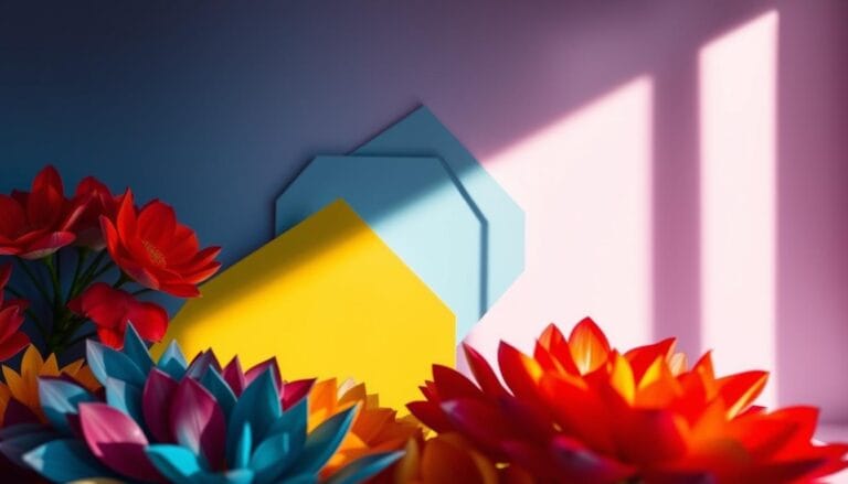
Why Certain Colors Always Look Good Together: The Secret of Hue Relationships
Ever walked into a room and felt drawn to its colors? The secret of hue relationships is more than picking colors at random. It’s a mix of visual psychology and design rules. Color theory shows how some colors can make spaces look amazing.
Colors do more than just look good. They send emotions, spark reactions, and make powerful visual experiences. Whether it’s a living room, a brand, or an outfit, the right colors can say a lot without words.
Designers and artists know color relationships are a deep science. Choosing colors wisely can make us feel certain ways, add interest, and send messages through looks.
Understanding Color Psychology and Emotional Impact
Color is more than just something we see. It’s a powerful way to express feelings, trigger body responses, and shape how we see the world. Color psychology shows how different colors can deeply affect our minds and feelings.
Our connection with color is complex, influenced by biology, culture, and personal experiences. Scientists have found interesting ways colors impact our thoughts and bodies.
Biological Responses to Color
Different colors can cause specific body reactions:
- Blue light can help focus and fight seasonal depression
- Red can make our heart beat faster and feel exciting or scary
- Green can calm us down and help us focus better
Cultural Color Associations
Colors mean different things in different cultures. What brings joy in one place might mean sadness in another. For example:
- In China, red means good luck and wealth
- White is purity in the West but mourning in some Asian cultures
- Purple once meant royalty and wealth
Personal Color Experiences
Your feelings about colors are shaped by your own memories and experiences. Color psychology says that certain color mixes can make you feel unique emotions based on your life.
Knowing how color, emotion, and perception work together can help you make better design and communication choices.
The Secret of Hue Relationships
Understanding hue relationships is like unlocking a visual language. It speaks directly to how we see the world. Color theory shows how colors interact and evoke emotions. This can change design, marketing, and how we communicate visually.
At the core of hue harmony is the color wheel. It reveals how colors on it interact. Researchers have found interesting facts about how colors affect us:
- 90% of first impressions are based on color.
- Users make judgments in 90 seconds, with color being key.
- Color affects 60% of whether we accept or reject something visually.
The beauty of color relationships comes from knowing how hues talk to each other. Color theory offers a scientific way to pick colors that go well together.
“Colors are the smiles of nature” – Leigh Hunt
Designers use special color strategies:
- Complementary colors for high contrast.
- Analogous colors for smooth transitions.
- Triadic colors for bold statements.
By understanding hue relationships, you can make designs that touch our hearts. They communicate well across different platforms.
The Color Wheel: Foundation of Harmony
Color theory starts with the color wheel. This circular diagram is your guide to mixing colors. It helps you create stunning color palettes that grab your attention.
The color wheel shows how colors relate to each other. It unlocks the secrets of visual harmony. Let’s explore the basic color categories that are key to color design.
Primary Colors: The Building Blocks
Primary colors are the foundation of color. Red, blue, and yellow are at the center of the color wheel. They can’t be made by mixing other colors. They are the original colors.
- Red: Passionate and energetic
- Blue: Calm and serene
- Yellow: Bright and optimistic
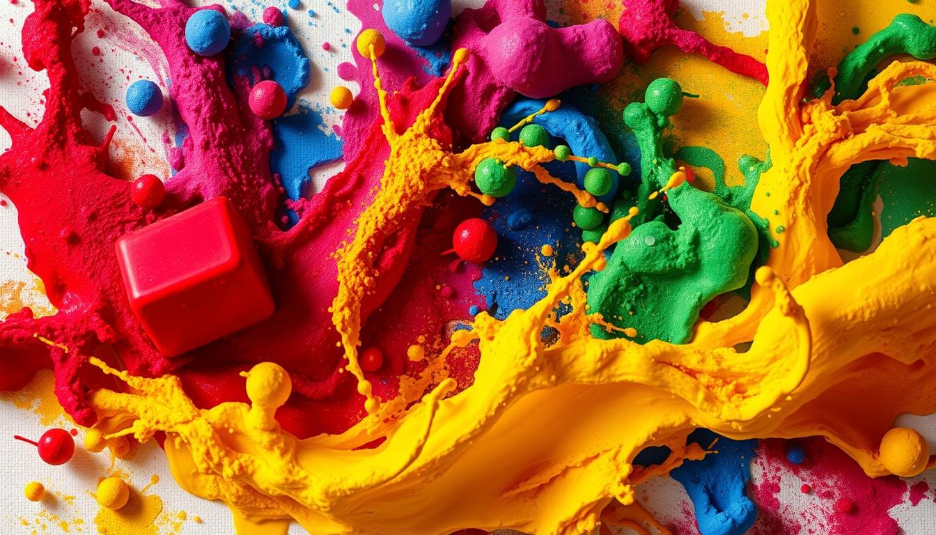
Secondary and Tertiary Colors: The Color Mixing Magic
Secondary colors are made when primary colors mix. Mixing two primary colors creates new, vibrant hues. This opens up new creative possibilities.
| Color Combination | Resulting Color |
|---|---|
| Red + Yellow | Orange |
| Blue + Yellow | Green |
| Red + Blue | Purple |
Complementary and Analogous Colors
Complementary and analogous colors are where the magic happens. Complementary colors are opposite each other on the wheel, creating bold contrasts. Analogous colors are next to each other, making harmonious and soothing combinations.
- Complementary pairs: Red and Green, Blue and Orange
- Analogous groups: Yellow, Yellow-Green, and Green
By grasping these color wheel principles, you’ll change how you design. You’ll create stunning color palettes that attract viewers.
Bold Color Combinations in Modern Design

Modern design has changed how we see color branding. Mid-century design introduced bold color mixes that still inspire today. By understanding color relationships, designers can create stunning spaces that grab attention and show off unique styles.
The history of color palette design shows interesting trends. In the 1950s and 1960s, designers started using bold color pairs that broke old design rules. Key traits of bold color mixes include:
- Vibrant primary colors like bright reds and deep blues
- Energizing accent colors that add visual interest
- Smart use of complementary color relationships
- Geometric patterns that boost color interactions
Today’s designers get ideas from old styles like De Stijl and Memphis design. These styles showed how bold colors can turn ordinary spaces into amazing ones. The trick is knowing color psychology and making colors work together well.
Color is a strong tool for communication that can change how we feel and see things.
When picking bold color mixes, keep these tips in mind:
- Begin with a neutral base
- Add 2-3 bold accent colors
- Use color temperature to add depth
- Match bright colors with softer ones
Whether you’re designing a living room, digital interface, or brand identity, knowing bold color mixes can make your work stand out.
Neutral Colors as Balancing Elements
Neutral colors are the unsung heroes of color theory. They provide a sophisticated backbone to any color palette. They act as visual anchors, letting your most vibrant hues shine without overwhelming the design. Understanding how to use neutral tones can change how you approach hue harmony.
The power of neutral colors is in their versatility. They create a calm foundation that lets other colors stand out and breathe. Here’s how different neutral tones contribute to design:
- White: Represents purity and spaciousness
- Black: Adds depth and sophistication
- Gray: Provides balanced sophistication
- Beige: Offers warmth and subtlety
The Role of White and Black
White and black are key to creating visual contrast. They help define spaces and highlight key design elements. Color theory shows that white can make a room feel larger, while black creates dramatic focal points.
Grayscale in Color Schemes
Grayscale offers a nuanced approach to neutral design. Using various shades of gray, you can create depth and complexity in your color palette. Professional designers often use grayscale for a sophisticated, modern look.
Earth Tones as Neutralizers
Earth tones like browns, tans, and muted greens serve as natural neutralizers. They bridge different color groups, creating harmonious transitions between bold and subtle hues. These colors connect your design to natural environments, adding warmth and organic appeal.
Creating Visual Harmony Through Color

Mastering hue harmony is crucial for stunning designs. Your color palette tells a story before words do. Understanding color theory helps you create spaces that feel intentional and captivating.
When designing your color scheme, follow the 60-30-10 rule for balanced visual impact:
- 60% dominant color (primary background)
- 30% secondary color (supporting elements)
- 10% accent color (eye-catching highlights)
Professional designers use color relationships wisely. Complementary colors create dramatic contrast. Analogous colors produce smooth, harmonious transitions. Your goal is to guide viewers’ eyes naturally through the design.
Consider these professional color selection techniques:
- Use digital color tools like Adobe Color
- Test color combinations in realistic contexts
- Understand psychological color associations
- Check accessibility and color contrast
Remember, color is a powerful communication tool. By carefully selecting your color palette, you can create spaces that feel intentional, engaging, and emotionally resonant.
Color Temperature and Spatial Perception
Understanding color temperature is key in color theory and psychology. Colors can change how we feel and see a space, beyond just decoration.
Warm and cool colors affect how we see a room. Warm colors like reds and oranges make spaces feel cozy and small. Cool colors, like blues and greens, make rooms seem bigger.
- Warm colors (2700K-3000K): Create cozy, inviting environments
- Cool colors (5000K-6500K): Enhance alertness and spatial perception
- Neutral whites (3000K-4500K): Provide balanced, adaptable lighting
Designers use color combinations to change how we feel in a room. Knowing about color temperature lets you make rooms feel bigger, more focused, or more relaxing.
| Color Temperature | Emotional Impact | Ideal Environment |
|---|---|---|
| 1000K-3000K | Warm, Relaxing | Living Rooms, Bedrooms |
| 3000K-4500K | Neutral, Balanced | Home Offices, Kitchens |
| 4500K-6000K | Focused, Energetic | Workspaces, Studios |
| 6000K-10000K | Alertness, Concentration | Laboratories, Hospitals |
Studies show color temperature affects our minds. Cooler lights around 5000K can boost productivity by up to 20%. Warmer tones help us relax and feel comfortable.
Professional Color Selection Techniques
Creating a strong color brand is more than just guessing. Experts use advanced methods to make color palettes that show off a brand’s identity and feelings.
Improving your color picking can be a big step with smart strategies and the latest digital tools. Knowing how to mix hues is key for designs that pop in all sorts of media.
Color Testing Methods
Experts use many ways to check if colors are right:
- Pantone color matching system
- Digital spectrophotometer analysis
- Simultaneous lightness contrast evaluation
- Chroma saturation assessment
Digital Color Tools
Today’s designers count on top-notch software for making color palettes:
- Adobe Color CC
- Coolors color generator
- Color Hunt professional palette creator
- Paletton design tool
Industry Standards
| Color Standard | Primary Application | Precision Level |
|---|---|---|
| CMYK | Print Design | High |
| RGB | Digital Design | Very High |
| Pantone | Brand Consistency | Absolute |
Learning these color picking methods will help you create designs that really connect with people. Your work will stand out in different places and touch different audiences.
Applying Hue Relationships in Different Industries
Color branding is more than just looks. Up to 90% of what we judge about a product comes from its color. This makes color harmony key in many fields.
Different areas use color in their own ways to reach out to people. For example:
- Technology companies often use blue to convey trust and stability
- Food brands employ red and yellow to stimulate appetite and excitement
- Healthcare organizations select green to communicate wellness and safety
- Luxury brands utilize purple to suggest premium quality and exclusivity
The psychology of color is deep in how we see things. Color selection can dramatically influence purchasing decisions. Certain colors can make us feel certain ways.
Global brands face a big challenge with color. What means joy in one place might mean sadness in another. To succeed, they adjust their color schemes to fit local tastes while keeping their brand’s essence.
Digital platforms really benefit from smart color choices. Colors like blue can ease eye strain, and red can make us feel a sense of urgency. Color plays a big role in how we feel when using digital products.
Color is not just visual – it’s a powerful communication tool that speaks directly to the human subconscious.
Conclusion
Learning color theory opens up a world of creativity. It’s not just about picking colors. It’s about how colors make us feel and think. This knowledge can change how you see design, art, and communication.
Color theory is both a science and an art. You’ll learn about colors that work well together. This knowledge lets you create stunning and touching works. Color theory is a powerful way to share ideas, feelings, and connect with people.
The study of color is always growing. New research shows how we see and feel colors. Whether you design, create art, market, or love visuals, knowing color theory helps. Be bold, trust your gut, and keep exploring color’s world.
Your color theory journey is just starting. Each color mix tells a story and evokes feelings. Let color harmony guide you as you create. It will open up new ways to express visually.
FAQ
What are hue relationships?
Hue relationships show how colors work together on the color wheel. They explain why some color mixes look good together. This is based on their position, warmth, and how they make us feel.
How do color combinations affect emotional responses?
Color mixes can make us feel certain ways. Warm colors like reds and oranges make us feel energetic. Cool colors like blues and greens calm us down. Knowing this helps in design and communication.
Why do some color combinations work better than others?
Good color mixes depend on their position on the color wheel and their warmth. They also rely on how much of each color is used. It’s all about balance and how colors interact with each other.
How do cultural differences impact color perception?
Colors mean different things in different cultures. For example, white is purity in the West but mourning in some Eastern cultures. Knowing these differences is key for global design and branding.
Can neutral colors really make a difference in color schemes?
Yes, they do! Colors like white, black, and earth tones are essential. They help balance bold colors and prevent chaos. They also add sophistication to color schemes.
How can I improve my color selection skills?
To get better at picking colors, study the color wheel and color theory. Try out different mixes and look at what works in design. Tools like digital color generators can also help.
What is the significance of color temperature?
Color temperature affects how we see and feel about a color. Warm colors like reds seem closer and energetic. Cool colors like blues feel deeper and calmer.
How do professional designers choose color palettes?
Designers use color theory, digital tools, and testing to pick colors. They think about the brand, audience, and the design’s purpose. They also use standards like Pantone.
Are there universal color harmony principles?
While color is subjective, some harmony rules apply. These include complementary and analogous colors, and balanced mixes. But, what works also depends on context and culture.
How do brands use color psychology?
Brands pick colors to show their personality and evoke feelings. Tech brands use blues for trust, while food brands use reds and yellows to excite. This makes their brand memorable.