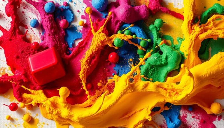
Mastering Color Harmony: A Beginner’s Guide to Perfect Palettes
Ever felt a strong connection to a design without knowing why? It’s all about mastering color harmony. Color theory is more than picking pretty colors. It’s about understanding the deep language of visuals.
Sir Isaac Newton’s work in the 1660s changed everything. He split white light into colors, starting color theory. This discovery showed how colors affect us.
Learning color harmony is an art that can make your designs stand out. It’s not just for designers or artists. Anyone who loves good visuals can benefit from knowing about color relationships.
Understanding the Science of Color Perception
Color perception is a complex mix of physics, biology, and psychology. Seeing colors is more than just looking at different hues. It involves light, special cells in your eyes, and how your brain interprets it.
The science of color starts with how light interacts with objects. White light has all the colors we can see. When light hits an object, some colors are absorbed, and others are reflected, creating the colors we see.
The Electromagnetic Spectrum and Human Vision
Your sense of color is based on how your eyes detect light wavelengths. The electromagnetic spectrum includes everything from radio waves to gamma rays. Visible light is a small but important part of this spectrum.
- Visible light wavelengths range from 380 to 700 nanometers
- Different wavelengths correspond to different colors
- Human eyes can perceive millions of color variations
How Our Eyes Process Color
Color psychology shows that your eyes have special cone cells for color detection. These cells are sensitive to red, green, and blue light. This lets your brain see a wide range of colors.
90% of consumers evaluate brands based on color alone, highlighting the profound impact of visual perception.
The Role of Light in Color Perception
Light is key in how we see colors. Color temperature, measured in Kelvins, affects how colors look. Warm light (around 2700K) makes colors look yellow, while cool light (6500K) makes them look blue.
| Light Temperature | Color Appearance | Emotional Response |
|---|---|---|
| 2700K | Warm Yellow | Cozy, Intimate |
| 6500K | Cool Blue | Calm, Focused |
Knowing how color perception works helps you make better design choices. It shows how light, color, and human experience are connected.
The Evolution of Color Theory: From Newton to Modern Day
Color theory has a long and interesting history. Humans started making pigments about 40,000 years ago. They used five colors: yellow, red, brown, black, and white. This was the start of understanding how we see colors.
In 1666, Sir Isaac Newton changed color theory with his color wheel. He showed that white light breaks into colors with a prism. Newton’s work was a big step in understanding color.
“Color is the place where our brain and the universe meet.” – Paul Cézanne
Many experts have helped color theory grow:
- Johannes Itten updated the color wheel in the 1900s
- Albert Henry Munsell made a color system we can use today
- Modern scientists have learned more about color and how it affects us
Color theory has had many important moments:
| Period | Key Development | Significance |
|---|---|---|
| 17th Century | Newton’s Color Wheel | First scientific approach to color |
| Early 20th Century | Munsell Color System | Standardized color measurement |
| Mid-20th Century | Itten’s Color Theories | Advanced artistic color understanding |
Today, color theory keeps growing, mixing art, science, and psychology. Knowing its history helps us see how colors affect us and the world.
The Color Wheel: Foundation of Harmonious Design
The color wheel is a key tool for understanding color relationships. It helps in creating stunning visual compositions. Isaac Newton developed it in the 17th century. This circular diagram explores the world of color combinations and complementary colors.
At the center of the color wheel are primary colors – red, blue, and yellow. These colors are the base for all other colors. Artists and designers use them to create complex color palettes.
Primary Colors: The Foundation
- Red: Energetic and passionate
- Blue: Calm and serene
- Yellow: Bright and optimistic
Secondary and Tertiary Colors
Mixing primary colors creates secondary colors, expanding your palette. The RGB model allows for up to 16 million shades through light mixing.
| Color Type | Creation Method | Examples |
|---|---|---|
| Secondary Colors | Mixing Two Primary Colors | Green, Orange, Purple |
| Tertiary Colors | Mixing Primary and Adjacent Secondary Colors | Red-Orange, Yellow-Green, Blue-Violet |
Understanding Color Temperature
Colors are warm or cool. Warm colors like red, orange, and yellow are energetic. Cool colors like blue, green, and purple are calming.
“Color is a power which directly influences the soul.” – Wassily Kandinsky
Knowing the color wheel helps you create beautiful designs. It’s useful in many creative fields.
Essential Color Attributes: Hue, Value, and Saturation

Color theory is all about three key attributes: hue, value, and saturation. These elements shape how we see and use colors in design.
Let’s explore these important color attributes:
- Hue: The pure color itself, representing the specific wavelength of light
- Value: The lightness or darkness of a color
- Saturation: The intensity or purity of a color
Hue is the base color on the color wheel. It’s the color’s core identity – like red, blue, or yellow. Changing hue shifts the color’s fundamental nature.
“Color is a power which directly influences the soul.” – Wassily Kandinsky
Value shows how light or dark a color is. Designers use value to add depth, contrast, and interest to their work.
Saturation shows a color’s brightness. A fully saturated color is bright and clear. Desaturated colors are softer and less intense.
| Color Attribute | Definition | Impact on Design |
|---|---|---|
| Hue | Base color | Defines color identity |
| Value | Lightness/Darkness | Creates depth and contrast |
| Saturation | Color intensity | Determines visual energy |
Understanding these attributes helps you create more complex and thoughtful designs. Knowing how hue, value, and saturation work together lets you use color theory and design more effectively.
Mastering Color Harmony: Principles and Applications
Color harmony is key to making designs pop. Knowing how colors work together can take your projects from good to great. By exploring different color schemes, you can tap into the power of color to move people’s emotions.
Good designers don’t pick colors randomly. They choose them to send a message about mood, energy, and purpose.
Complementary Color Combinations
Complementary colors are opposite each other on the color wheel. They make designs stand out with their bold contrast. Here are some classic examples:
- Red and Green
- Blue and Orange
- Yellow and Purple
Analogous Color Schemes
Analogous colors are next to each other on the color wheel. They create designs that feel smooth and calm. These schemes are great for a relaxed look. Here are some common ones:
- Blue, Blue-Green, Green
- Red, Red-Orange, Orange
Split-Complementary Arrangements
Split-complementary schemes offer a balanced contrast. You pick a base color and two colors next to its complement. This mix adds interest without losing balance.
“Color is a power which directly influences the soul.” – Wassily Kandinsky
| Color Scheme | Emotional Impact | Best Use |
|---|---|---|
| Complementary | High Energy | Attention-Grabbing Designs |
| Analogous | Calm and Harmonious | Cohesive Branding |
| Split-Complementary | Balanced Contrast | Sophisticated Layouts |
Mastering color harmony is about knowing how colors affect us. Try out different schemes to find your own style.
Color Psychology and Emotional Impact

Color psychology shows how colors affect our feelings. Each color has its own emotional impact. This knowledge can change how we design.
Different colors make us feel different ways:
- Red: Symbolizes passion, urgency, and energy
- Blue: Represents calmness, trust, and stability
- Green: Signifies growth, nature, and tranquility
- Yellow: Communicates happiness and optimism
- Purple: Suggests luxury and creativity
Color psychology is not just about single colors. Mixing colors can tell powerful stories in design. Warm colors like red and orange make us excited. Cool colors like blue and green help us relax.
“Colors speak a language deeper than words, communicating directly with our emotions.”
When using color psychology in design, think about your audience and the feelings you want to create. For example, professional brands might use blue for trust. Creative fields might pick vibrant purple for innovation.
Knowing about color psychology can make your designs more than just pretty. By choosing and mixing colors wisely, you can influence how people feel. This makes your designs more impactful and meaningful.
Practical Applications in Visual Design
Turning color theory into real-world design needs smart thinking about color mixes and looks. Knowing how colors work together in different places is key. This knowledge helps you make designs that grab attention.
Digital vs. Print Color Considerations
Color design needs you to know the big difference between digital and print. Digital uses RGB, while print is CMYK. Knowing this helps keep colors looking right everywhere.
- Digital (RGB): Great for screens and digital displays
- Print (CMYK): Best for things you can hold in your hand
Creating Balanced Color Palettes
Creating nice color mixes takes careful picking and planning. Experts say stick to 2-6 colors to keep things looking good together.
| Color Palette Strategy | Key Characteristics |
|---|---|
| Monochromatic | One color with different shades |
| Complementary | Colors that are opposite each other on the wheel |
| Triadic | Three colors that are evenly spaced on the wheel |
Color in Branding and Marketing
Color is super important for how people see a brand. Studies show 75% of people judge a brand by its color. Choosing colors wisely can really affect how people feel and what they buy.
Colors speak louder than words in brand communication.
Your design should focus on color psychology, making sure it’s easy to see, and making a strong impression. This way, you create designs that people remember and find effective.
Common Color Harmony Mistakes and How to Avoid Them
Mastering color harmony can be tough, even for pros. Knowing common mistakes helps you make better color combos.
Designers often struggle with balanced color palettes. The 60-30-10 rule is a simple fix. It says:
- 60% Dominant color (primary shade)
- 30% Secondary color (supporting tone)
- 10% Accent color (vibrant highlight)
Many mistakes come from bad color choices. Here are key errors to dodge:
- Overwhelming color usage: Keep your colors limited to avoid mess
- Insufficient contrast: Make sure text and background colors are easy to read
- Ignoring color psychology: Think about how colors make people feel
“Color is a power which directly influences the soul” – Wassily Kandinsky
Tools like Adobe Color Wheel and Canva Color Palette Generator can aid in testing colors. Always think about accessibility and how colors look to people with color vision issues.
By grasping these color harmony principles, you’ll craft designs that are both sophisticated and engaging. They will effectively share your message.
Conclusion
Mastering color harmony is more than picking nice colors. It’s an art that mixes science with creativity. The 60-30-10 rule is a great way to make designs pop in many areas. It helps balance main, secondary, and accent colors, making designs stand out.
Your color harmony journey is just starting. Design pros know color theory is always changing. The skills you’ve learned will make your color palettes hit the mark emotionally and visually. These principles will make your work shine, whether it’s a website, brand identity, or marketing materials.
Keep practicing to get better at color harmony. Tools like Adobe Color and online generators can help. Each design is a chance to use color theory, which can boost engagement by up to 30% with the right colors.
As design trends change, being open and curious is key. Keep trying new color schemes, learning about their effects, and exploring new ideas. Your skill in creating beautiful, impactful designs will make you stand out in a world that loves visuals.
FAQ
What is color harmony and why is it important in design?
Color harmony is about making colors work well together. It’s key in design because it makes things look balanced and appealing. It helps send your message clearly and touch the right emotions. Knowing color harmony helps make your designs more professional and impactful.
How do I choose the right color palette for my design project?
Begin by learning about the color wheel and color relationships. Think about using complementary, analogous, or triadic color schemes. Consider the mood you want to create and who your audience is.
Use color psychology to guide your choices. Always think about the mood or message you want to share.
What are the primary color combination techniques?
There are several main color combination techniques:
– Complementary colors: Colors opposite each other on the color wheel
– Analogous colors: Colors next to each other on the color wheel
– Triadic colors: Three colors equally spaced on the color wheel
– Monochromatic: Different shades and tints of a single color
Each technique creates a different look and feel.
How does light affect color perception?
Light greatly affects how we see colors. Different lights can change a color’s look, including its warmth, brightness, and tone. Natural and artificial light, as well as the environment, can change how we see colors. So, it’s important to think about lighting when using color in design.
What are the most common color harmony mistakes to avoid?
Common mistakes include:
– Using too many colors in one design
– Not having enough color contrast
– Ignoring color accessibility for color-blind viewers
– Not thinking about the emotional impact of colors
– Not testing colors in different lights and settings
How can I improve my understanding of color psychology?
To get better at color psychology:
– Learn about the emotions colors evoke
– Study successful brand color strategies
– Try out color combinations in your designs
– Understand cultural differences in color perception
– Practice making mood boards and color palettes
– Keep up with current color trends in design
What’s the difference between hue, value, and saturation?
Hue, value, and saturation are the three main color attributes:
– Hue: The pure color itself (red, blue, green)
– Value: How light or dark a color is
– Saturation: How intense or pure a color is
Knowing how these work together helps you create more detailed and complex color designs.
How do digital and print color models differ?
Digital and print use different color systems:
– RGB (Red, Green, Blue): For digital screens
– CMYK (Cyan, Magenta, Yellow, Key/Black): For print
Each model has its own way of showing colors, so picking the right one is key for your design.