The Role of Color in Marketing : Emotional Persuasion Through Design
Ever wondered why some brands grab your attention while others don’t? The answer is color psychology. It turns marketing into a way to connect emotionally. Studies show that up to 90% of what we think about products comes from color alone.
Color in marketing is more than just looks. It’s a secret language that talks to your mind, guiding your choices without you even knowing. With 85% of customers picking brands based on color, knowing color psychology is key for success.
Your brand’s colors are more than a choice. They’re a way to talk to people’s feelings. Colors like red make us feel urgent, while blue makes us trust. Each color has its own power to change how people see and act towards your brand.
Understanding Color Psychology in Marketing
Color psychology shows how colors affect our feelings and choices. Our brains quickly process colors, leading to strong feelings that shape how we act and interact with brands.
Color perception is more than just seeing colors. Studies show that up to 90% of our first impressions of products are based on color. This shows how much color impacts our feelings and thoughts.
The Science of Color Perception
Seeing colors is a complex brain process. Different light wavelengths trigger various emotional and physical reactions. This creates unique experiences for consumers.
- Color triggers immediate emotional reactions
- Different hues activate distinct neural pathways
- Psychological responses vary across individuals
Colors and Consumer Behavior
Marketers use color psychology to shape brand experiences. Research shows that certain colors can greatly affect our buying choices and loyalty to brands.
| Color | Psychological Impact | Marketing Application |
|---|---|---|
| Red | Excitement, Urgency | Call-to-Action Buttons |
| Blue | Trust, Stability | Financial, Tech Brands |
| Green | Growth, Harmony | Wellness, Eco-Friendly Products |
Cultural Context of Color Meanings
Colors mean different things in various cultures. What’s positive in one culture might be sad in another. It’s key to understand these differences for global marketing.
Colors speak a universal language with intricate local dialects.
Knowing color psychology helps marketers create more meaningful brand experiences. These experiences connect deeply with their audience.
The Role of Color in Marketing: Impact on Brand Recognition
Colors are key in visual marketing, boosting brand recognition. Studies show 85% of shoppers pick products based on color. This makes color vital for a strong brand image.
Your brand’s colors do more than look good. They show your company’s personality, values, and spirit. Color psychology shows certain colors evoke different feelings.
“Color is a powerful communication tool that can signal action, influence mood, and cause physiological reactions.” – Marketing Insights Report
Here are some ways to use color for brand recognition:
- Choose colors that match your brand’s message
- Use the same colors in all your marketing
- Know how colors are seen in different cultures
- Make emotional connections with your color choices
UPS and T-Mobile are great examples of color branding. UPS uses brown for stability, and T-Mobile’s magenta shows energy and new ideas. These color choices can make your brand 80% more recognizable.
When planning your visual marketing, remember colors do more than grab attention. They leave lasting impressions that people remember and link to your brand.
Primary Colors and Their Marketing Applications
Colors are key in advertising, sending messages and shaping how we feel. The right colors can make your brand stand out. Studies show 90% of first impressions are based on color.
Knowing how primary colors work is vital for good marketing. Each color has its own emotional impact, helping your brand connect with people.
Red: Power, Passion, and Urgency
Red is a strong color in ads. It makes us feel things deeply, like:
- Increasing heart rate by 5-10 beats per minute
- Creating a sense of urgency
- Stimulating excitement and passion
“Red commands attention like no other color” – Marketing Color Psychology Expert
Blue: Trust, Stability, and Professionalism
Blue is a favorite for corporate brands, chosen by 47%. It’s linked to:
- Representing reliability
- Promoting calmness
- Decreasing heart rate by 10-20%
Yellow: Optimism, Energy, and Attention
Yellow grabs our attention fast. It’s shown to:
- Increase click-through rates by 20%
- Generate feelings of optimism
- Work well in call-to-action designs
Using primary colors wisely can change how people feel about your brand. It helps create strong connections with your audience.
Secondary Colors in Brand Communication

Secondary colors play a big role in how brands talk to us. They help brands stand out by using colors that connect with people’s feelings. This makes brands more relatable and memorable.
Secondary colors add depth and class to a brand’s look. Let’s see how these colors can make your marketing better:
- Green: Shows growth, balance, and care for the planet
- Orange: Means warmth, creativity, and being friendly
- Purple: Talks about luxury, mystery, and new ideas
When picking secondary colors, keep these tips in mind:
- Match colors with your brand’s main message
- Know how colors are seen in different cultures
- Make your audience feel something with your colors
“Color is a strong tool for talking to people. It can show your brand’s personality and values right away.”
Studies say 84% of shoppers pick products based on color. Secondary colors are a smart way to make your brand unique. They help create lasting memories with your audience.
Instagram is a great example of using secondary colors well. They mix yellow, orange, pink, magenta, and purple in their look. This makes their brand lively and engaging, drawing people in and building strong connections.
The Psychology of Neutral Colors in Marketing
Neutral colors are key in design, especially in luxury and minimalist styles. They show class without being too much. Knowing how they affect us can change how we market.
About 70% of luxury and tech brands use neutral colors. They make things look professional and modern. These colors are great at saying a lot without saying too much.
Black: Luxury and Sophistication
Black is the ultimate sign of elegance in marketing. Luxury brands use it to show:
- Exclusivity
- Power
- Sophistication
- Premium quality
“Black is not a color, it’s an attitude.” – Coco Chanel
White: Simplicity and Cleanliness
White stands for simple design. It shows:
- Purity
- Simplicity
- Transparency
- Modern elegance
Gray: Balance and Professionalism
Gray is all about balance. Brands pick gray for:
- Professionalism
- Stability
- Corporate reliability
- Sophisticated neutrality
Using neutral colors wisely can make your marketing stories powerful. They connect with people on a deep level.
Color Combinations and Visual Hierarchy
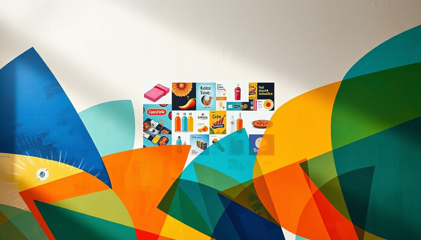
Mastering color combinations is key for creating engaging visual hierarchies in marketing design. Research in neuromarketing shows that smart color use can greatly affect how people see and interact with products.
Your color palette is more than just pretty—it’s a strong way to communicate. Studies indicate that up to 90% of first impressions about products come from color. This makes your color strategy very important for your brand’s success.
“Color is a power which directly influences the soul” – Wassily Kandinsky
When making visual hierarchy with color combinations, keep these important points in mind:
- Create contrast to guide viewer attention
- Use complementary colors wisely
- Make emotional connections
- Keep brand consistency
| Color Combination Strategy | Psychological Impact | Marketing Effectiveness |
|---|---|---|
| Warm color accent | Energetic, passionate | Increases impulse engagement |
| Cool color foundation | Calm, trustworthy | Builds long-term brand reliability |
| Monochromatic palette | Sophisticated, cohesive | Enhances brand recognition |
Keep in mind that color perception can differ across cultures. What works in one market might not work in another. Continuous testing and refining your color combinations are crucial for the best marketing results.
Emotional Persuasion Through Strategic Color Use
Colors are more than just pretty pictures. They connect with our emotions, making marketing more powerful. Knowing how colors affect us can strengthen your brand’s bond with people.
Color psychology is fascinating. Up to 93% of shoppers choose products based on how they look, with color being key. This means brands can make deep emotional connections with their audience.
Creating Emotional Connections
Choosing colors wisely lets you speak without words. Each color can stir different feelings:
- Red signals passion and urgency
- Blue represents trust and stability
- Green suggests growth and harmony
- Yellow communicates optimism and energy
Driving Purchase Decisions
Color greatly affects how we shop. A simple color change can boost sales by up to 21%. Marketers who get color psychology can craft visuals that nudge customers toward buying.
Building Brand Loyalty
Using the same colors consistently makes your brand stand out. About 80% of people think color makes a brand more recognizable. Keeping a consistent color scheme across all platforms strengthens your brand’s identity and emotional ties.
“Color is a power which directly influences the soul.” – Wassily Kandinsky
Your color strategy can turn casual browsers into loyal fans. It speaks to their emotions and hidden desires.
Color Trends and Consumer Preferences
Color trends are key for good advertising design. Studies show that up to 90% of first impressions come from color. This makes color a strong tool in marketing. Your brand’s colors can really affect how people feel and interact with your brand.
Each group has its own color likes:
- Women often like lighter shades like pink and pastels
- Men tend to prefer bolder colors like blue, green, and red
- Colors mean different things in different cultures
Color trends change with society. Choosing colors wisely can boost brand awareness by up to 80%. This shows how important color is in how people feel about brands.
“Color is a power which directly influences the soul” – Wassily Kandinsky
Research on color trends gives us interesting facts:
| Color | Emotional Response | Marketing Impact |
|---|---|---|
| Red | Urgency, Excitement | Increases conversion by 21% |
| Blue | Trust, Stability | Builds consumer confidence |
| Green | Tranquility, Health | Promotes wellness brands |
To lead in advertising design, keep up with new color trends. Know how they connect with your audience. Your color choices can make you stand out in a crowded market.
Conclusion
Color psychology shows how big of a role color plays in marketing. It’s not just about looks; it’s a key strategy for connecting with people. Studies say 85% of shoppers pick products based on color, showing how crucial it is.
Using color psychology, you can make visuals that really speak to people. Colors like blue for trust and black for luxury send messages fast. Brands that get color right can boost recognition by 80% and connect more deeply with customers.
To succeed in visual marketing, know about cultural and demographic color meanings. Use colors wisely in your designs to grab attention. Think about your audience’s age, gender, and culture to pick colors that match their needs.
As marketing changes, using color well will help you stand out. Try new color strategies, keep up with trends, and remember each color has a story. Make sure your brand’s story is one that touches your customers’ hearts.
FAQ
How do colors influence consumer behavior in marketing?
Colors deeply affect how we feel and what we buy. Red makes us feel urgent and excited. Blue makes us trust and feel professional. Green makes us think of calmness and caring for the planet.
Marketers use colors to connect with us on an emotional level. They guide how we see their brand. This helps them reach their audience better.
Why is color important for brand identity?
Color is key to making a brand stand out. It helps people remember a brand quickly. This makes a brand’s image clear and strong.
Studies show color can boost brand recognition by up to 80%. Brands like Coca-Cola and Facebook show how a unique color can define a brand.
How do cultural differences impact color interpretation in marketing?
Colors mean different things in different cultures. This is why global marketing must consider these differences. For example, white is purity in the West but mourning in some Asian cultures.
Brands that succeed globally adapt their colors to fit different cultures. This ensures their message is understood and appreciated everywhere.
Can color really influence purchasing decisions?
Yes, it can. Research shows 85% of buying decisions are based on color. Colors can make us feel certain ways without us realizing it.
Warm colors like orange and red make us feel urgent. Cool colors like blue make us trust. Luxury brands use black and gold to show they’re high-end.
What are the most effective colors for marketing different industries?
Each industry needs its own color strategy. Tech companies use blue for trust. Food brands use red and yellow to make us hungry.
Health brands use green for naturalness. Banks use blue and green for stability. The goal is to match the right color with the feeling you want to create.
How often should brands update their color strategy?
Brands should check their colors every 3-5 years. This keeps them fresh and appealing. But, small changes or new colors can keep a brand feeling modern.
Watching design trends and what people like helps guide these updates. It keeps the brand looking good without losing its identity.
What are the psychological effects of neutral colors in marketing?
Neutral colors like black, white, and gray are very effective. Black is luxury, white is simple, and gray is professional. These colors work well in designs that show elegance and quality.
Brands like Apple use these colors to show they’re high-end and timeless. It’s a smart way to communicate value through design.



One Comment
Comments are closed.